Neat. Not necessarily strategic, but definitely cool.
Created by Brand New School for Goodby Silverstein and Partners
10.31.2008
My apologies, Corona
Fine. You win. The billboard was pretty ok.
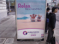
In defense, however, of my original argument against the Corona ad, this is exactly what EB was talking about--it's a strategy that isn't unique to the product, not even to the category. It's a bad version of the Corona ad, for Hawaiian Airlines.
This, on the other hand, reads like a poorly written brief. Talk about half-baked:
In defense, however, of my original argument against the Corona ad, this is exactly what EB was talking about--it's a strategy that isn't unique to the product, not even to the category. It's a bad version of the Corona ad, for Hawaiian Airlines.
Thus, while Corona just got boosted up a bit in my head, Dentyne still owns.
10.29.2008
Corona billboard
While returning from work yesterday, I also saw a billboard for Corona. It had an image a beach scene, looking at the shoreline between two palm trees with two sets of swimsuits hanging on a line between them, drying. The only text on the board read "Online" which sent me in three different directions over my 10 minute taxi home.
First, because Corona is losing share of market and consumption is going down for the first time in ages, I know they've been pushing their AOR Cramer-Krasselt to get going with interactive and online communications. So my first thought was that it was an awareness campaign, telling people that you can find Corona online and being "cute" with the juxtaposition of the brand and all its beautiful beachy images making its way to your screens.
For quite a while I thought about how it's really lame, and it basically takes the idea that Dentyne recently came up with about using the insight of how attached we are to communicating through technology and convinces us to "make face time," a cute way to tell you to chew some gum because a real kiss is much better than that smoochy face on AIM.
But then I realized that I probably went there because of the "curse of knowledge," and I came up with some other interpretation of the ad. I can't really remember it, probably because I was fishing for strategy and distracted.
Then suddenly I realized it was just a really really really BAD play on words. Corona has always been really great at simple image ads, but I've seen some great simple text ads from them, too. I really liked the somewhat similar Dentyne campaign, but this was a huge disappointment, and here's why:
When I first saw the Dentyne hug ad with the text "Friend Request Accepted," I thought it was a really awful classic case of men in suits thinking if they talk the talk, we'll think they're hip. Well, my problem was I was on BART in SF and couldn't read the rest of the text behind the other commuters, and thus completely missed the quick lines about "log off, turn on" and all those little pieces, as well as the "make face time" slogan. As soon as I saw it all, I thought they were really cute, and based in a very real consumer insight.
The Corona ad, on the other hand, is just a play on words, and it's a bit of a stretch if they hoped it would convey their message. Yes, I get that they're trying to say there's "a better way to be online" or whatever, but it felt weak, an almost knee-jerk reaction to the basic idea.
I'm sure there are lots of people who enjoyed this, and perhaps at other times it would have worked, but I think when another category used a similar strategy in a more meaningful way in such a close proximity of time, you look to be lacking a bit.
Cheers to McCann Erickson NY for the Dentyne campaign.
Involved Consumers
On my ride to and from the office the last few days, I keep noticing a billboard that makes me giggle, but not because of it's message--I laugh because of how a local has altered it.
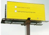
The billboard has only two lines, with boxes next to each for you to mentally "check" as the option you'll choose. They read "Stick head in sand" and "Fight globalwarming.com." In green spray paint, someone had cross out "sand" and replaced it with "pool," and checked the box, changing it to "Stick head in pool."
Sorry fightglobalwarming.com, I liked your sentiment, but you really did set yourself up for that one.
The original:
10.14.2008
The Paradox of Time
Isn't it always the case that the more time you have, the less you do with it? I always seem to be the most productive when I'm busy, which probably means you'll be hearing more from me soon.
Until I get into the groove of busy, I'd suggest you take a look at Yaybia. Entertaining AND smart. It's good stuff.
Enjoy.
10.06.2008
Good Work- Travelers Insurance
In my airport adventures I also found a really great example of using new technology to your advantage.
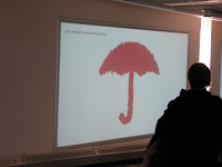
The ads were for Travelers Insurance, with four in a row down a hallway into the F terminal at MSP. Each had a image of the red umbrella with the simple tagline "The strength to withstand anything."

However, these ads weren't just print--they were interactive wall displays by Monster Media. Each of the umbrellas were made up of tiny little umbrellas that moved much like leaves.
When people walked by or stood in front of the screens, the tiny umbrellas scattered in response to their movement.

As soon as they walked away, the umbrellas returned to their original position.

The reason I thought this was so great was firstly because agency use the technology in an innovative way, putting it on the wall instead of the floor, as we see with Reactrix. It created a platform for unintentional interaction and made it much more noticeable for both those who participated and those who watched. It in fact made me want to participate, so after watching and taking pictures, I went and played for a few moments.
But secondly, the most important part of why this was great was because THE MEDIUM REFLECTED AND REINFORCED THE MESSAGE. Up to this point, I've only seen Reactrix and other similar technologies used as a cool factor, but never to facilitate in communicating the message. This relationship between the medium and the message makes this ad the best I've seen in quite a while.
Good work, Travelers. Props to Fallon for this one.
Almost- Samsung, Proactiv, Sprint
I did a fair bit of traveling last week and thus spent a good deal of time thinking about airport advertising. While it seems they've got the idea of "add value" and appropriate sponsorship down pat, there's still a whole lot of bad advertising, wasted money, and poorly-thought-out displays.
On the bad side, I found a pillar for Samsung that had electric outlets for people to recharge their phones. The space to lay your phone was too small for a laptop, but certainly adequate for a number of people to place their phone while waiting for it to get juiced up. Above the electrical outlets was a hollowed pillar that has a Samsung phone in it with some stats about why its a sweet phone. While I think all of this is well done and an appropriate use of adding value to the consumer while they interact with (or at least think about) your product, there was one huge problem: the pillars were placed on the edge of the main hallways, where there were no chairs to sit and keep watch of your phone as it charged. The nearest chairs were always facing the opposite direction, giving the heavy traffic walking through the terminal painfully easy access to your iPhone, Blackberry, etc. No good.
I also saw, and not for the first time, a large vending machine for...nope, not Apple products this time...Proactiv. So I get that its an interesting shopping experience, certainly something mostly unique. But where was the connection between the product and the mode of purchasing? Not that Apple makes much more sense, but at least there's this idea of new technology that fits with the new purchasing experience. But why Proactiv? Why are acne topical creams being sold so prominently at the airport anyway? I've never once seen anyone go up to the large, branded vending machines. I don't imagine people would want to call attention to themselves while purchasing acne treatements, and yet these vending machines are loud and obtrusive, and not in a good way. Needless to say, I'm not a fan.
I had pictures of both of these taken on my phone but with Samsung phones through Sprint, you can't take your pictures off your phone unless you sign up for picture mail, at $5/month. So...even though it's my content, I can't have it anywhere other than my phone unless I pay. I only just discovered this last week, and I have to say, Sprint, I'm disappointed.
10.02.2008
HFCS- But you were doing so well!
I was skimming through my mom's copy of Everyday Food (more or less a mini recipe book plus tips for noobs like me) and I came across a print ad in the same campaign as those cheesy but ultimately successful ads I wrote about a while ago. I was sorry to see this:
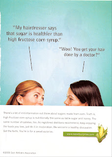
What the heck, guys? I saw it and immediately though, "But those other ads told me something else. Who is THIS ad from?" Whereupon I looked down, saw the logo, and realized I better re-read the headlines.
"OOOOOOhhhhhh, it's supposed to be tongue-in-cheek..."
Knowing that consumers are more likely to read just the headline than they are the headline + the body copy, this ad did little to educate, which seems to be the purpose of the campaign. Certainly its ok to attempt some humor, but it was much easier for me to respond to just the headline and skip the body copy, which explains the sarcasm. Maybe it was just the speed at which I was paging through, but that just puts me as a typical consumer. Had I not been attuned to the campaign in the first place, I probably would have taken the "fact," turned the page, and never given it a second thought. Especially because the "fact" given is the common misconception that they're trying to reverse, it didn't quite hit the mark.
I'm not saying they shouldn't have used humor, or made an attempt at more creativity in their education, but I think the ad was poorly done and ineffective, and possibly might set them back further.
Subscribe to:
Posts (Atom)

